Sensorlyze User Manual
1. Getting Started: Installing Sensorlyze
Two options are available for running Sensorlyze:
- A standalone executable file
- The open-source python code for the software
Both options are available on github.
Running the executable file
The .exe file is available for downloading. This version is currently only windows compatible.
Running the open-source python code
To run the python script, download the gui_sensorlyze.py file and supporting .py files. Make sure that the supporting files are in the same folder as\the main script. To prompt the GUI, run gui_sensorlyze.py.
The following packages are required to run the script: * numpy
-
pandas
-
scipy
-
scikit
-
matplotlib
-
pyqt
-
sklearn
2. Using Sensorlyze : Start and Experiment Selection
Once the software is prompted to run either by running the source code or by clicking on the icon of the .exe file, a window will appear, prompting you to start or exit Sensorlyze.
Sensorlyze contains four modules, defined as experiments. Selecting start will prompt a new window [select experiment] to open. Click on the grey box to see a list of options.
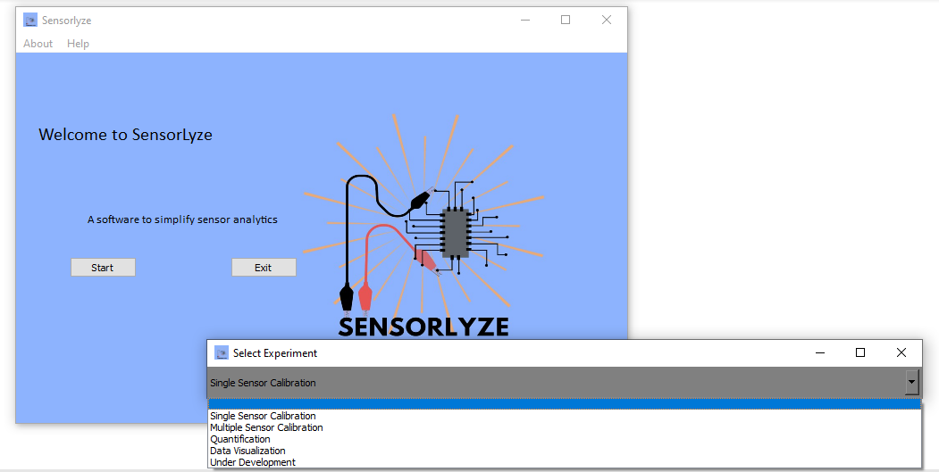
To perform the correct analysis, you can navigate through the options and select the option which matches best with your analysis needs:
Single sensor calibration- Analyze chronoamperometric data corresponding to a single sensor/file.Multiple sensor calibration- Analyze chronoamperometric data corresponding to multiple sensors/files.Quantification- Select and extract data from regions of interest and quantify concentrations from regression parameters.Data Visualization- Visualize multiple data files and export them into a single graphic.
Acceptable File Formats
The import file functionality currently supports the following file types:
 *.asc    # HEKA file format.
 *.txt    # Biologic file format
 *.txt    # CH Instruments file format  **
 *.xslx   # Excel file format           **

 **These file formats are not supported by the Data Visualization analysis option*
3. Analysis Options
Single Sensor Calibration
This window is split into two main tabs.
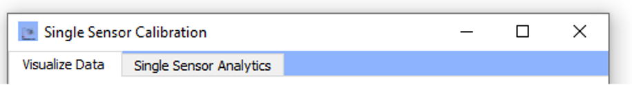 To go through the data analysis follow the steps outlined for each tab:
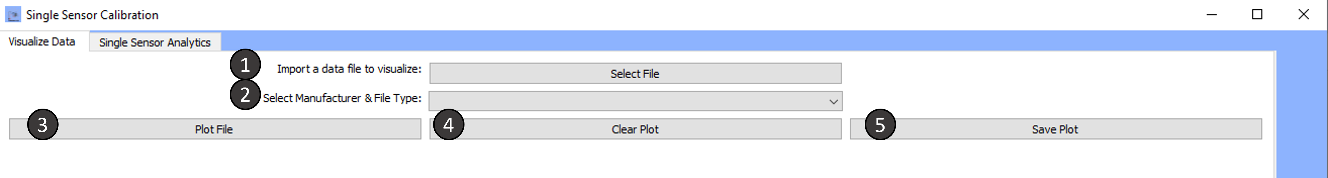
Tab 1: Visualize Data
-
Import a data file to visualize:
To import, select the file in the directory of choice.
-
Select the Manufacturer and file type:
The import file option currently supports files from the following manufacturers: HEKA, Biologic, CH Instruments, Excel
Select the desired file type to proceed.
-
Plot File:
Current-time data within the selected file will be plotted.
-
Clear Plot:
Plotted data will be cleared from the window. Clicking on plot file will cause the data to reappear.
Alternatively, a new data file may be imported using steps 1-3 and plotted.
-
Save Plot:
The plot will be saved in the directory of your choice.
Current supported file formats for saving graphics are:
*.png,*.jpgand*.tifffile formats
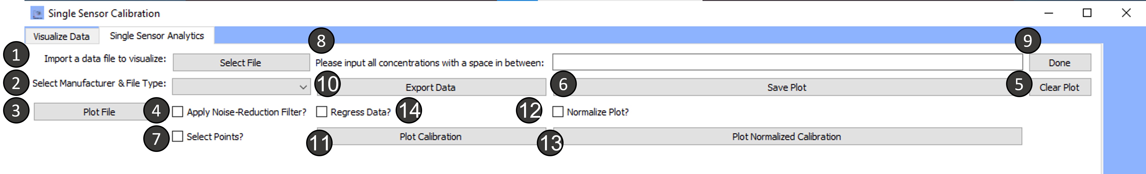
Tab 2: Single Sensor Analytics
-
Import a data file to visualize:
To import, select the file in the directory of choice.
-
Select the Manufacturer and file type:
The import file option currently supports files from the following manufacturers: HEKA, Biologic, CH Instruments, Excel
Select the desired file type to proceed.
-
Plot File:
Current-time data within the selected file will be plotted.
-
Apply Noise Reduction Filter:
Checking the box will apply the noise reduction filter.
The data is filtered using a first-degree polynomial Savitzky-Golay filter. The Savitzky-Golay filter uses convolution-based filtering, i.e. fitting sub-sets of data points with a low degree polynomial using linear least squares.
Unchecking the box will remove the noise filtered data and the original data will reappear.
-
Clear Plot:
Clicking this button will clear the plot of the raw or filtered data.
-
Save Plot:
The plot will be saved in the directory of your choice.
Current supported file formats for saving graphics are:
*.png,*.jpgand*.tifffile formats -
Select Points:
Checking the select points box will allow you to extract the mean of the current values over a time period of 30 seconds.
Once the checkbox for select points is chosen, a blue bar will appear. The blue bar is automatically set to average data over a range of 30s. The range can be changed by moving either xmin or the xmax limit of the bar further or closer (hover over the limit under a red vertical line appears and then drag the line)
Select points (with or without noise-reduction filter- range is automatically set to 30 seconds, but can be modified)
To select multiple points, click in the middle of the bar, and drag the bar to the region(s) of interest. You can select as many regions as you desire.
-
Please input all concentrations with a space in between :
Once you have selected the points of interest, to build a calibration curve, you must enter the concentrations corresponding to each selection.
Make sure to enter the concentrations in μM and with a space in between each value.
-
Done:
When you have finished entering concentrations, click on the button done to proceed.
-
Export Data:
Clicking on export data will export the mean currents from the selected regions and the concentration corresponding to each region.
The data is automatically exported into an excel sheet named "Results" in the same working directory as the software files.
- If you would like to export points only and no concentrations, enter a range of indices instead of concentrations
- If you would like to export the points and concentrations, click export data after including the right concentration corresponding to each mean current
-
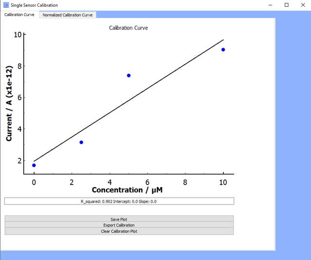
Plot Calibration:
Clicking on
plot calibrationwill allow you to visualize the current-time calibration profileOnce you click
plot calibration, the calibration profile will appear along with three other options (see figure below for example):- Save Plot: Save the graphic in
*.png,*.tiffor*.jpgfile formats - Clear Calibration Plot: Clear the calibration plot
- Export Calibration: The data will export to an excel sheet called Results in the same working directory as the software.
If the
regress data?box is checked, then the regression parameters will also export to the same excel sheet.
- Save Plot: Save the graphic in
-
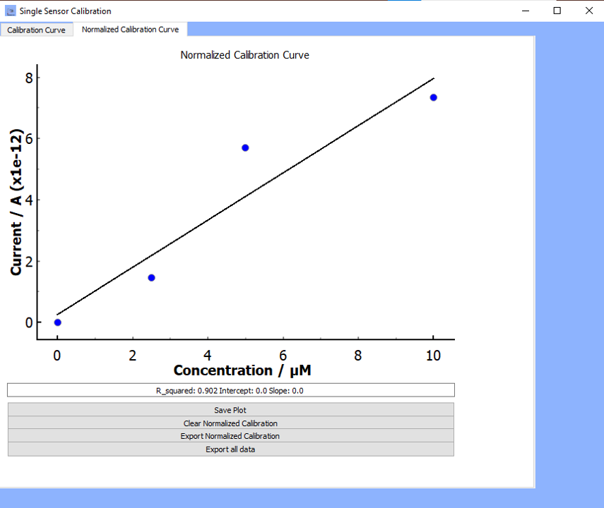
Normalize Plot?:
Checking the box for normalize plot will normalize to the baseline through background current substraction.
i.e. the first selected set of points using select points correspond to the current from the background signal. All following mean currents are substracted from this baseline signal.
-
Plot Normalized Calibration:
Clicking on
plot normalized calibrationwill allow you to visualize the current-time calibration profileOnce you click
plot normalized calibration, the calibration profile will appear along with three other options (see figure below for example):- Save Plot: Save the graphic in
*.png,*.tiffor*.jpgfile formats - Clear Normalized Calibration: Clear the calibration plot
- Export Normalized Calibration: The data will export to an excel sheet called Results in the same working directory as the software.
If the
regress data?box is checked, then the regression parameters will also export to the same excel sheet.
- Save Plot: Save the graphic in
-
Regress Data?:
Checking the box for regress data will cause the following regression parameters to appear in a textbox above the calibration plot:
- Slope, Intercept, R²
To show the regression data for the unnormalized calibration curve, make sure that the checkbox for for normalize plot is unchecked.
To show the regression data for the normalized calibration curve, make sure that the checkbox for for normalize plot is checked.
-
Export all Data:
Clicking on export data will allow you to export all data obtained from this module into a single excel files consisting of multiple sheets.
- To export the data correctly, please ensure that you have regressed the data for both the unnormalized and normalized calibrations
Exporting the data will generate an excel file with three sheets which consist of:
- Raw current-time series data
- Calibration data including the mean current values for each concentration and the regression parameters
- Normalized calibration data including the mean current values for each concentration and the regression parameters
Multiple Sensor Calibration
This window is split into three main tabs. To go through the data analysis follow the steps outlined for each tab:
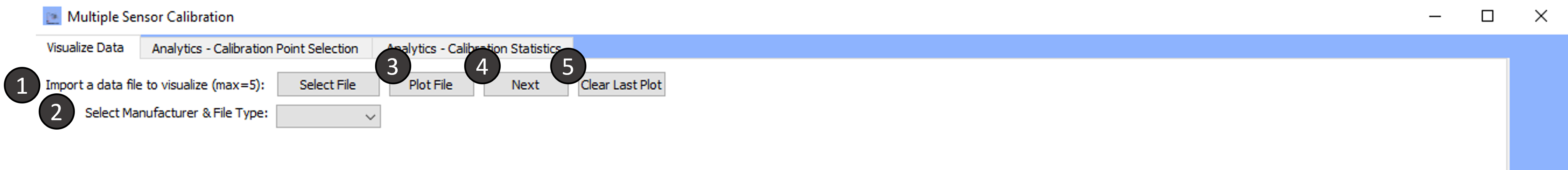
Tab 1: Visualize Data
-
Import a data file to visualize:
To import, select the file in the directory of choice.
-
Select the Manufacturer and file type:
The import file option currently supports files from the following manufacturers: HEKA, Biologic, CH Instruments, Excel
Select the desired file type to proceed.
-
Plot File:
Current-time data within the selected file will be plotted.
-
Save Plot:
The plot will be saved in the directory of your choice.
Current supported file formats for saving graphics are:
*.png,*.jpgand*.tifffile formats -
Clear Plot:
Data from the most currently plotted file will be cleared from the window. Clicking on plot file will cause the data to reappear.
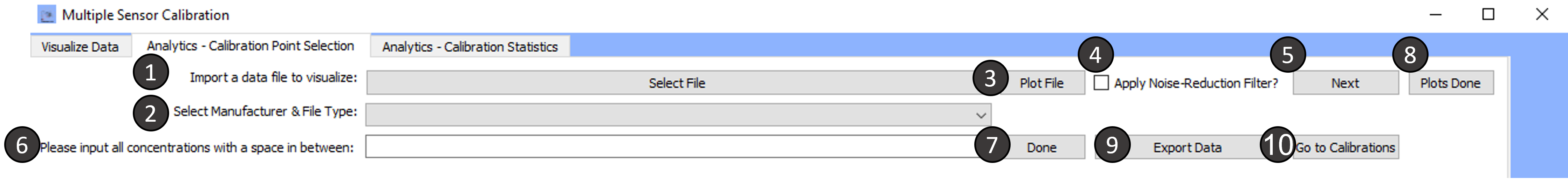
Tab 2: Analytics- Calibration Point Selection
-
Import a data file to visualize:
To import, select the file in the directory of choice.
-
Select the Manufacturer and file type:
The import file option currently supports files from the following manufacturers: HEKA, Biologic, CH Instruments, Excel
Select the desired file type to proceed.
-
Plot File:
Current-time data within the selected file will be plotted.
You may select multiple regions considered as points (the mean over the range selected is automatically calculated).
To select new regions, drag the blue bar to the region of interest.
Make sure you keep count of how many regions were selected in the first file as all selects made in the following files must have the same number of selections.
-
Apply Noise Reduction Filter:
Checking the box will apply the noise reduction filter.
The data is filtered using a first-degree polynomial Savitzky-Golay filter. The Savitzky-Golay filter uses convolution-based filtering, i.e. fitting sub-sets of data points with a low degree polynomial using linear least squares.
Unchecking the box will remove the noise filtered data and the original data will reappear.
If you select points from the noise filtered plot, the points exported will not contain the original raw data.
Instead, for the specific file, the mean currents from the noise filtered data are presented.
-
Next:
Click on next when you would like to proceed to visualizing the next data file. The next data file does not have to be the same file format as the previously plotted file. Make sure you change the manufacturer by selecting a new manufacturer.
-
Please input all concentrations with a space in between :
Once you have selected the points of interest, to build a calibration curve, you must enter the concentrations corresponding to each selection.
Make sure to enter the concentrations in μM and with a space in between each value.
-
Done:
When you have finished entering concentrations, click on the button done to proceed.
-
Plots Done:
When you have completed analyzing all your desired files, click on this button.
You must click this button only after entering the done button for concentrations. Otherwise, you will run into issues with correctly exporting the data.
If you forget to click on the
Donebutton for concentrations and you click on thePlots Done, you can still export the data correctly.All you need to do is enter the concentrations, click on
Done, and click again onPlots Done. -
Export Data:
Clicking on export data will export the data to an excel file with multiple sheets as follows:
- Sheet 1 (Individual file currents): Rows for each file imported. Each column has the data point with the selection corresponding to the index.
- Sheet 2 (Mean Currents vs. Concs) : One with column with the concentrations and another column with the corresponding mean.
This will not work if you have not entered concentration values.
The data is automatically exported into an excel sheet named "Results" in the same working directory as the software files.
If you would like to export points only and no concentrations, enter a range of indices instead of concentrations.
-
Go to Calibrations:
Clicking on
Go to Calibrationswill move the current tab to the next tabAnalytics-Calibration Statisticswhere the regression parameters for the calibrations are shown.
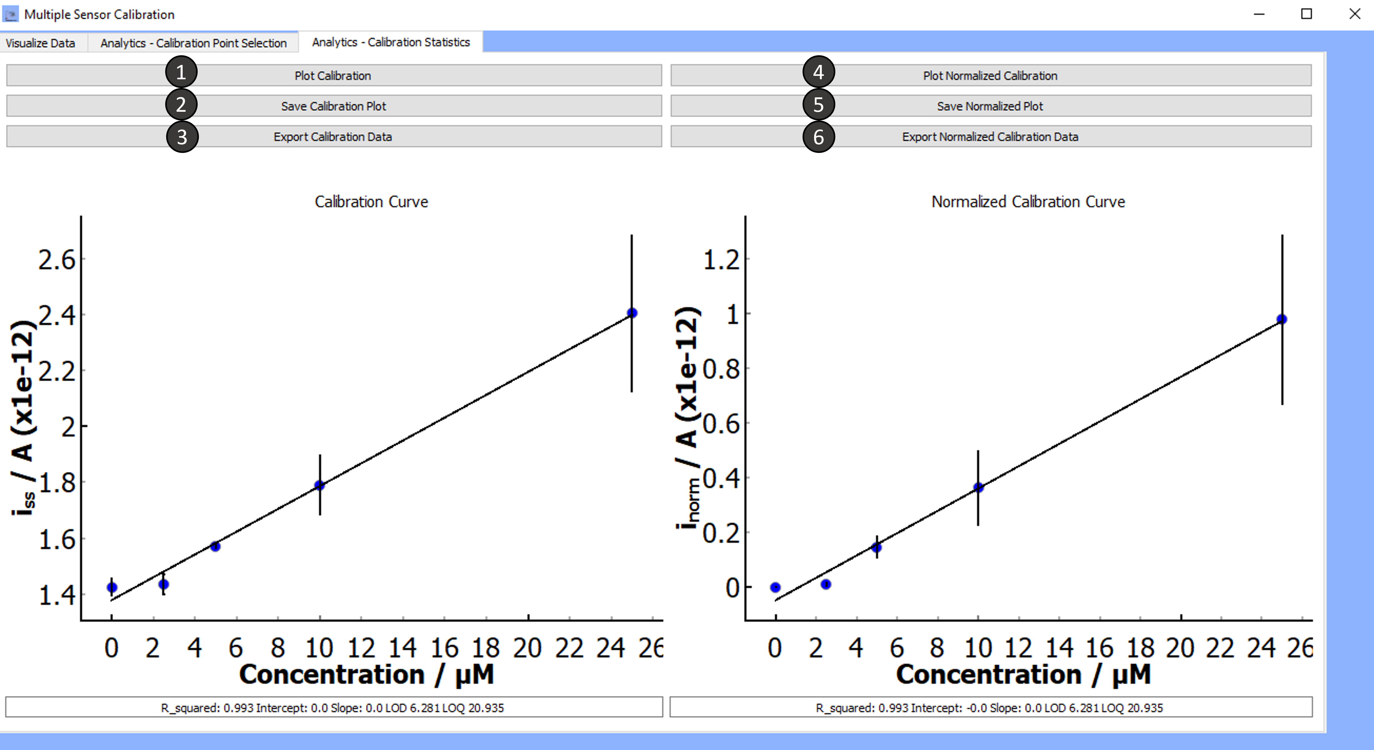
Tab 3: Analytics- Calibration Statistics
-
Plot Calibration:
Clicking on plot calibration will show a plot of the calibration along with the following regression parameters:
- R², Slope, Intercept, LOD*, and LOQ**
- * LOD is the limit of detection, defined as 3 times the standard deviation of the blank signal divided by the slope of the regression line.
- ** LOQ is the limit of quantification, defined as 10 times the standard deviation of the blank signal divided by the slope of the regression line. Note: Values will show to 3 decimal places. If you get a value of 0, exporting the data will show you the real value.
- R², Slope, Intercept, LOD*, and LOQ**
-
Save Calibration Plot:
Clicking on
save calibrationwill allow you to save the plot in the directory of your choice.Current supported file formats for saving graphics are:
*.png,*.jpgand*.tifffile formats -
Export Calibration Data:
Clicking on
export calibration datawill automatically save the calibration data in an excel file namedCalibrationlocated in the same working directory as the software.The data exported data will consist of two tables in the same sheet:
- Table 1- Columns with the
- Concentration
- Average currents from all the data files for each concentration
- Standard deviation for the currents used to calculate the mean current
- Standard error of the mean (SEM) for each mean current value
- Table 2- Calibration regression statistics:
- R², Intercept, Slope, LOD, and LOQ
- Table 1- Columns with the
-
Plot Normalized Calibration:
Clicking on plot normalized calibration will show a plot of the normalized calibration along with the following regression parameters:
- R², Slope, Intercept, LOD*, and LOQ**
- * LOD is the limit of detection, defined as 3 times the standard deviation of the blank signal divided by the slope of the regression line.
- ** LOQ is the limit of quantification, defined as 10 times the standard deviation of the blank signal divided by the slope of the regression line. Note: Values will show to 3 decimal places. If you get a value of 0, exporting the data will show you the real value. Normalized currents are background signal subtracted current values.
- R², Slope, Intercept, LOD*, and LOQ**
-
Save Normalized Calibration Plot:
Clicking on
save normalized calibrationwill allow you to save the plot in the directory of your choice.Current supported file formats for saving graphics are:
*.png,*.jpgand*.tifffile formats -
Export Normalized Calibration Data:
Clicking on
export normalized calibration datawill automatically save the calibration data in an excel file namedNormalized Calibrationlocated in the same working directory as the software.The data exported data will consist of two tables in the same sheet:
- Table 1- Columns with the:
- Concentration
- Background subtracted average currents (normalized average currents) from all the data files for each concentration
- Standard deviation of the normalized currents used to calculate the mean current, standard error of the mean (SEM) for each normalized mean current value
- Table 1- Columns with the:
- Table 2- Calibration regression statistics:
- R², Intercept, Slope, LOD, LOQ, Standard Deviation of the Blank
- For each set of currents obtained for a single data file, the currents are normalized by subtracting the background current from each current value. Once this has been completed for each file, the mean current for each concentration from the different files is calculated and displayed in the table.
Notes:
- The standard deviation for the baseline (zero) concentration will always be zero.
- The standard error of the mean for the baseline (zero) concentration will always be zero.
- For LOD and LOQ calculations, the the standard deviation of the blank used is the standard deviation of the unnormalized current readings for the blank signals.
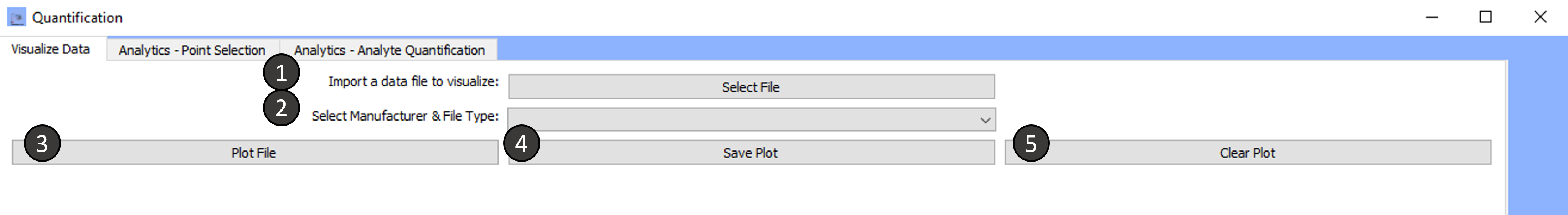
Quantification
This window is split into three main tabs. To go through the data analysis follow the steps outlined for each tab:
Tab 1: Visualize Data
-
Import a data file to visualize:
To import, select the file in the directory of choice.
-
Select the Manufacturer and file type:
The import file option currently supports files from the following manufacturers: HEKA, Biologic, CH Instruments, Excel
Select the desired file type to proceed.
-
Plot File:
Current-time data within the selected file will be plotted.
-
Save Plot:
The plot will be saved in the directory of your choice.
Current supported file formats for saving graphics are:
*.png,*.jpgand*.tifffile formats -
Clear Plot:
Data from the most currently plotted file will be cleared from the window. Clicking on plot file will cause the data to reappear.
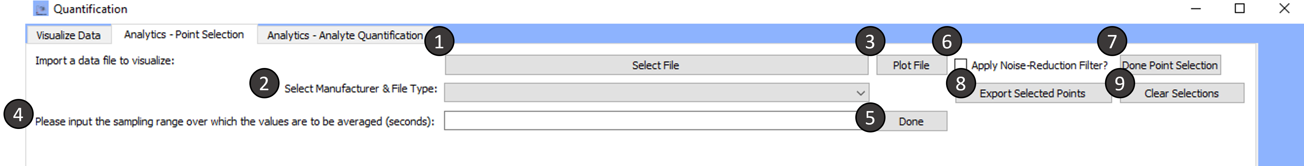
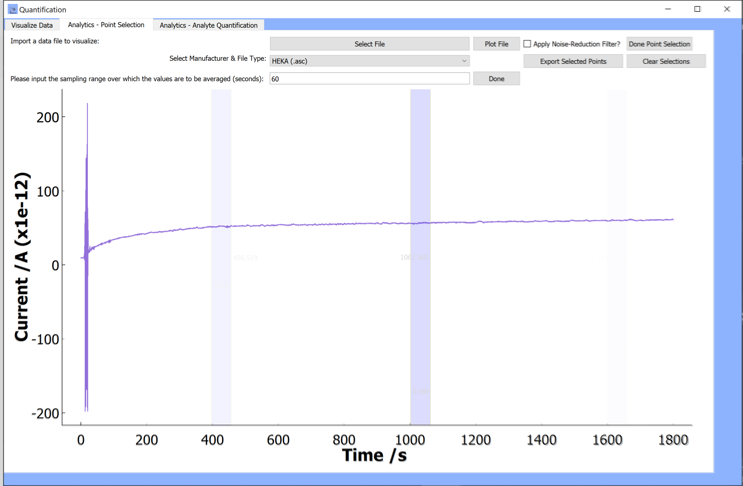
Tab 2: Analytics- Point Selection
-
Import a data file to visualize:
To import, select the file in the directory of choice.
-
Select the Manufacturer and file type:
The import file option currently supports files from the following manufacturers: HEKA, Biologic, CH Instruments, Excel
Select the desired file type to proceed.
-
Plot File:
Current-time data within the selected file will be plotted.
-
Please input the sampling range over which the values are to be averaged (seconds):
This option will allow you to enter a sampling range (in seconds) over which the current data is averaged.
For example, if you would like to get the mean current for a 30 second sampling frequency, enter 30 into the textbox. The current data over a range of 30s will be extracted from the plot each time the blue bar is moved. These values will be averaged over time range to provide a mean current value.
-
Done:
When you have entered a value to change the sampling range, click on
doneA blue bar will appear on the plot. This blue bar can be moved to different regions of the data so that the data over the length of the bar is averaged and saved each time it is moved.
-
Apply Noise Reduction Filter:
Checking the box will apply the noise reduction filter.
The data is filtered using a first-degree polynomial Savitzky-Golay filter. The Savitzky-Golay filter uses convolution-based filtering, i.e. fitting sub-sets of data points with a low degree polynomial using linear least squares.
Unchecking the box will remove the noise filtered data and the original data will reappear.
If you select points from the noise filtered plot, the points exported will not contain the original raw data.
Instead, for the specific file, the mean currents from the noise filtered data are presented.
-
Done Point Selection:
When you have completed selecting all regions of interest in the plot, click on
done point selection -
Export Selected Points:
Clicking on export selected points will export the following to an excel file called
Quant_Selected_Points:-
Table 1 [Time Points(first,last)] - A row with range of time points for each selection made in the data file (i.e. for each time the blue bar was dragged from one region to another). Only the first and last time point for each selected region are recorded. A row above with the corresponding point indices is also included.
-
Table 2 [Current Values(first,last)]) - A row with first and last current reading collected from the range of time points for each selection made in the data file (i.e. for each time the blue bar was dragged from one region to another). Only the first and last time current reading for each selected region are recorded. A row above with the corresponding point indices is also included.
-
Table 3 [Mean Currents (A)] - A row with the mean current from the average of current values across the range of time points for each selection made in the data file. (i.e. if the length of the blue bar was 30s, the first index would include the average of currents measured for 30s corresponding to the first region the blue bar was moved to). A row above with the corresponding point indices is also included.
Notes:
- All indexing begins at zero. - The data is automatically exported into an excel sheet named `Quant_Selected_Points` in the same working directory as the software files. -
-
Clear Selections :
Clicking on
clear selectionswill remove the blue bar and allow you to select a different sampling range and a new set of points to be exported.
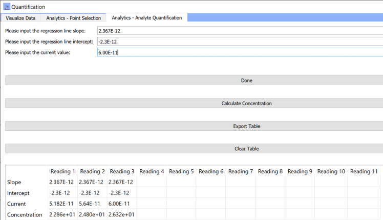
Tab 3: Analytics- Analyte Quantification
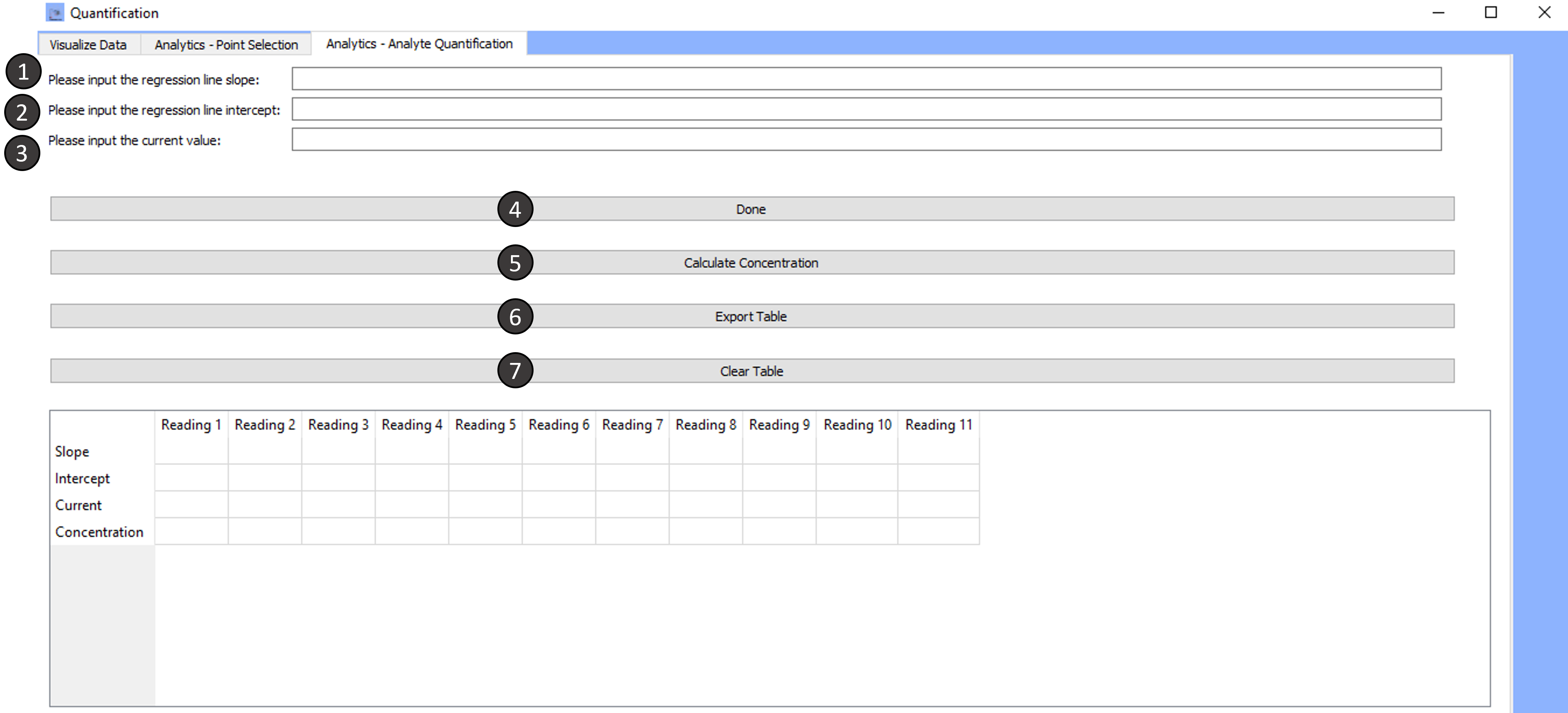
-
Please input the regression line slope:
Input the slope of the regression line. This could be a slope obtained through earlier analysis using the
Analytics- Point Selectiontab. -
Please input the regression line intercept:
Input the intercept for the same regression line as the one used for the slope input.
-
Please input the current value:
Input the current reading you have. Make sure that the calibration regression line parameters correspond to the same sensor used for experimental measurements.
-
Done:
Once you have completed all fields in the textboxes above this button, click on Done.
Clicking on done will add the entered values into the table displayed on the window.
-
Calculate concentration:
After clicking on done, click on
calculate concentrationto calculate analyte concentration from the current reading and the regression parameters.The calculated concentration will appear in the
concentrationrow in the table.Steps 1-5 can be repeated multiple times, with either the same regression parameters or varying regression parameters, to calculate the concentration for multiple sensor readings from the current values.
Currently, the table can hold up to 12 measurements/readings.
-
Export table:
Clicking on export table will allow you to export the table to an excel file.
The file can be named and saved in the directory of your choice as a .xslx file.
-
Clear table:
Clicking on clear table will clear all tabular values. You can re-populate the table by inserting new values into the textboxes in the window.
Data Visualization
This window consists of solely one tab.
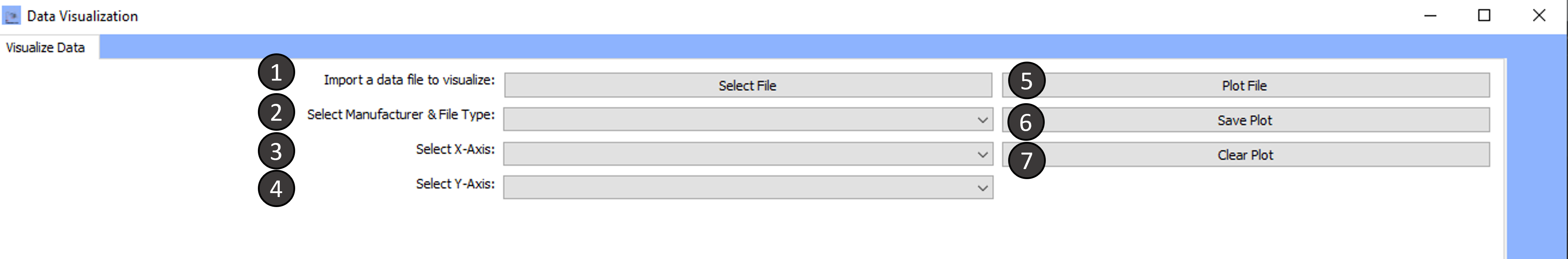
To go through the data analysis follow the steps outlined:
Tab 1: Visualize Data
-
Import a data file to visualize:
To import, select the file in the directory of choice.
You can import one file or multiple files simultaneously by clicking the
ctrlbutton and the filename. -
Select the Manufacturer and file type:
The import file option currently supports files from the following manufacturers: HEKA and Biologic
Select the desired file type to proceed.
-
Select X-Axis:
From the drop down menu, select the desired x-axis.
For HEKA files, use one of the following: Emon ,Imon, Time For Biologic files, use one of the following: Time, Ewe, I * Emon and Ewe correspond to the **Potential** header for HEKA and Biologic files respectively ** Imon and I correspond to the **Current** header for HEKA and Biologic files respectively -
Select Y-Axis:
From the drop down menu, select the desired x-axis.
For HEKA files, use one of the following: Emon ,Imon, Time For Biologic files, use one of the following: Time, Ewe, I * Emon and Ewe correspond to the **Potential** header for HEKA and Biologic files respectively ** Imon and I correspond to the **Current** header for HEKA and Biologic files respectively -
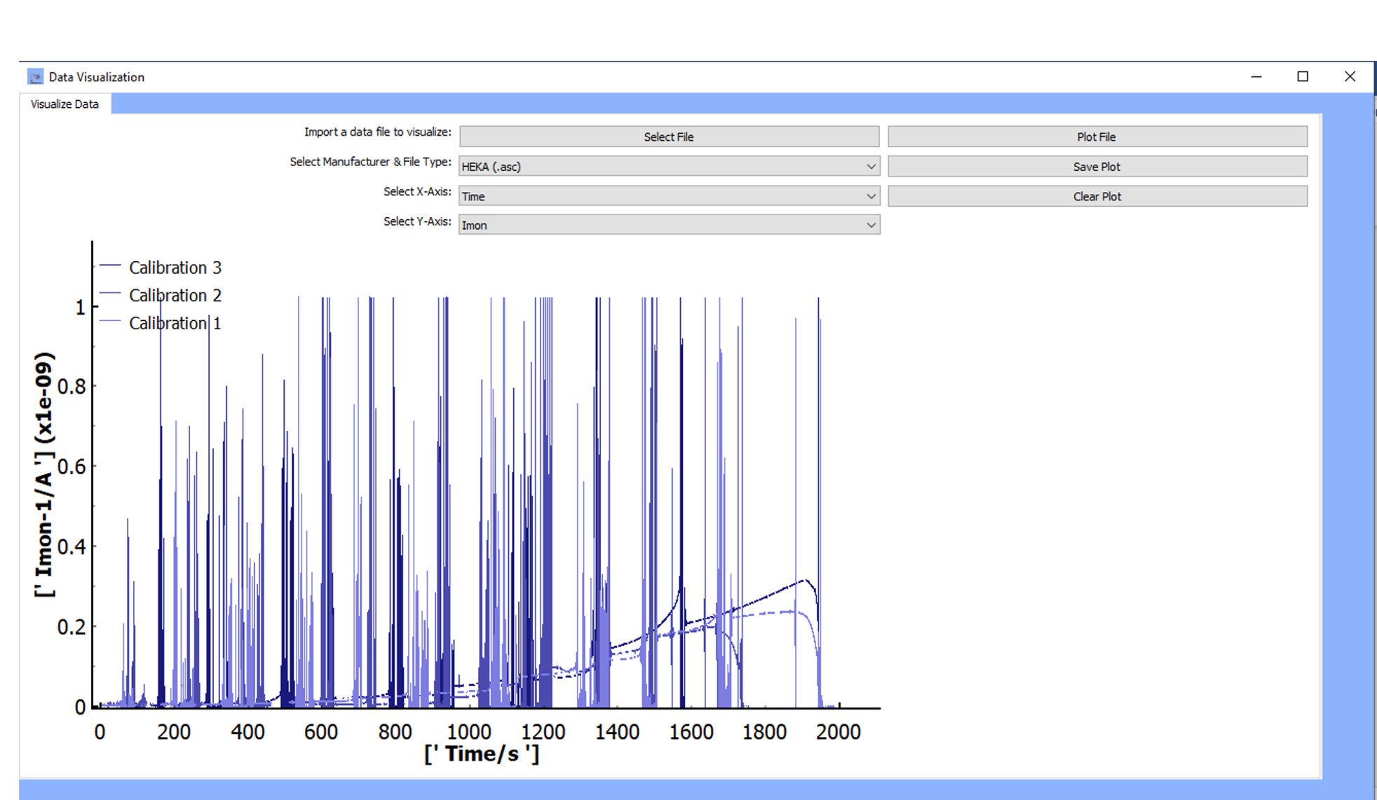
Plot File:
The data with the selected x and y-axes will be plotted. If more than one file was selected, data for all files and their chosen x-and y-axes will be plotted.
A legend is available to identify the files displayed.
-
Save Plot:
The plot will be saved in the directory of your choice.
Current supported file formats for saving graphics are:
*.png,*.jpgand*.tifffile formats -
Clear Plot:
Data from the most currently plotted file will be cleared from the window. Clicking on plot file will cause the data to reappear.
Under Development
Future releases will include plot formatting functionality as well as other data treatment processes.